I made this little graphic organizer in response to an eLearning Heroes Design Challenge within the Articulate Storyline 360 community. The task was pretty straightforward: come up with a “cheat sheet” or graphic organizer to quickly convey whatever an instructional designer might need to know about ADDIE.
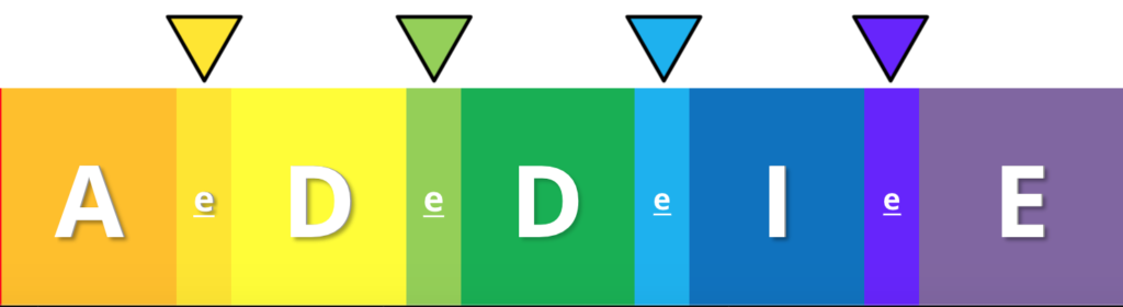
ADDIE is the instructional design model I got most familiar with as an independent contractor and instructor.
You start with some Analysis, to learn about your learners and see what resources you have to work with.
Then you Design your learning objectives and course materials, preferably working backwards from the goals you settled on in phase one.
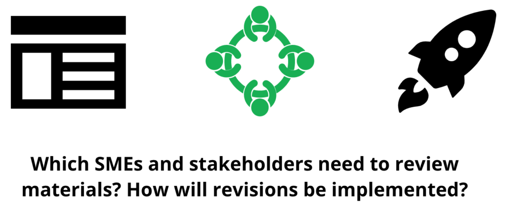
You Develop your learning resources in consultation with stakeholders and experts.
You set up a dry run to Implement the design.
Finally, you Evaluate how it all went.
ADDIE isn’t perfect, but when you’re a hired gun and a team of one like I’ve been, you don’t necessarily have the interchangeable human resources necessary to make a more drop-the-needle-and-see-what-happens method (like SAM) work. That said, ADDIE is seldom as linear as it looks — nor should it be!
When I undertook this challenge, I wanted to create a visual that encouraged users to toggle back and forth between the steps so that they could connect earlier questions to later ones.
I also wanted a design that reinforced the importance of formative evaluation, as well as summative.
And I also wanted to highlight how it felt to be thrown into a design process for the first time. I had a lot of questions!
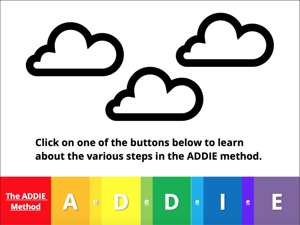
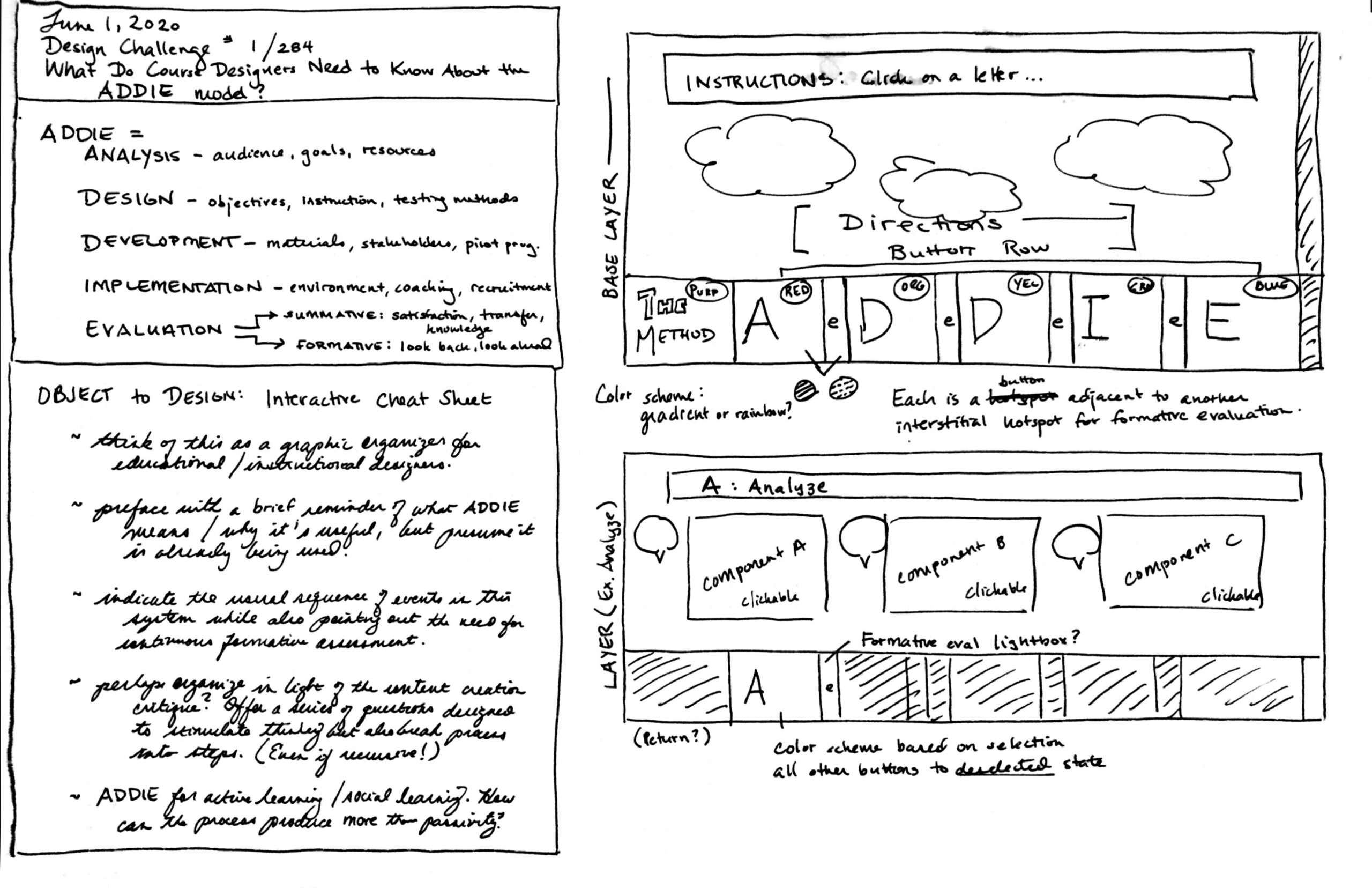
I put together a paper mock-up next to a list of some of my goals, including some that I didn’t ultimately get to translate into the final design (the last one about social learning). Basically the whole thing would be a single slide, composed of a base layer and a series of overlays triggered by a row of buttons across the bottom.
Mine is hardly the first rainbow-based ADDIE graphic out there, but there were a couple of distinctive features I wanted to include:

You can see between the big capital letters of ADDIE are a bunch of little e’s. That’s formative evaluation! Each little e triggers the same layer, as a reminder that evaluation should happen throughout the design process.
Each layer has three clickable icons, each of which reveals a question relevant to that phase of the process. The color coding and toggling between a “selected” state and a “default” state was something I settled on while building.
The biggest practical challenge was to have a “zero out” button that would allow for a return to default when users click from one layer to another. In the end, I could only partly implement what I wanted to here.
For the most part, even though this was a time-consuming build, the final product came out as intended. The icons are (I think!) fun to play with and toggle through, and the “Home” button serves as an effective way of wiping the slate clean when you’re done looking at a layer. You don’t have to click “Home,” though; if you want, you can move straight from A to I and back again.
I was originally going to make each button dim or dull except for the selected layer, but I really hated how it made the rainbow look all lifeless and sad. So instead, I built the little moving arrow, the inverted triangle, to indicate the selected button for the user. That also let me draw attention to the more “tropical” color palette I used for the interstitial little e’s.
The biggest design hitch was using Articulate’s built-in icons. Some have been reduced to single shapes. But many are groups of three, seven, FIFTEEN parts, like this icon here. Even if grouped into an icon, you have to edit each piece individually.
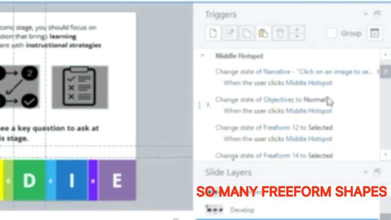
Setting separate triggers for each and every one of those graphic elements was a massive time sink, and if I wanted to, say, trigger a return to normal whenever the user clicks into ANY other layer, I would need to produce multiple sets of triggers for each of those parts, for each state, for each command.
Not worth it to me for a quick-n-dirty exercise. So in the current version, navigating between ADDIE layers without going home means the layers remember what icon you clicked on last.
Who knows? Maybe this feature is even a bug, reminding the user of the last question they saw without having to click back through from a neutral state.
Definitely a great little workout for getting comfortable manipulating layers and setting triggers, though! And a firm reminder that in the future I should approach the built-in icon sets with caution. Manipulating states for a one-component image? Fine. Manipulating states for a FIFTEEN-component image? Yikes.